Canada’s Centennial Symbol


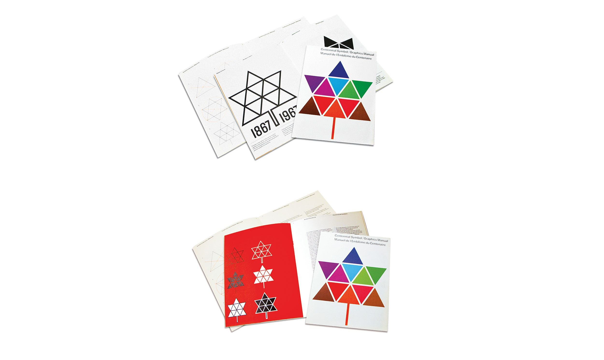
After a failed design competition to create the Centennial logo, the federal government approached typesetting and design firm of Cooper & Beatty to create a logo. The design house wrote a brief, approved by the government, stating all the strategic requirements, including that the symbol would epitomize Canada and could include a maple leaf, eleven elements representing the country’s geography at the time ( ten provinces, plus Canada North ) and other elements. 

The government chose Ash’s maple leaf constructed from eleven equilateral triangles — one of the first times the maple leaf had been officially chosen to represent the country. The manual illustrated, among other things, how any school classroom could geometrically construct the symbol using the rudimentary tools available to them. The logo was adopted across the country during Canada’s 100th anniversary, in applications ranging from being stencilled into sidewalks and planted in flowerbeds, to being cut into people’s hair.

Metric Symbol


The Metric Commission was an agency established by the federal government in 1971 to facilitate Canada’s conversion to the metric system from the imperial system of weights and measures. Gottschalk+Ash incorporated a stylized maple leaf in the letter M, ensuring the metric symbol was simple enough that children could easily incorporate it in their school projects. It was also made adaptable for many different uses at a wide range of sizes. 

Although trademarked by the Commission, the logo was free to use by any organization producing Canadian metric products. Usually shown in red, the metric symbol could be adapted to a wide variety of reproductions, including other shades of red, as well as black or white on a red background. It was versatile enough to work well, whether embossed on the head of a bolt or appearing on packaging or a sheet of plywood. 

SkyDome


Gottschalk+Ash created a visual identity and wayfinding system for SkyDome, the city’s premier multi-use sports and entertainment centre, to present a friendly and inviting face to the public. The anchor of the identity would be the new SkyDome logo, with its “D” opening like the actual stadium roof, which would become one of the most recognized features of the Toronto skyline. 

The design team ( in partnership with Keith Muller and Associates ) developed identity graphics used for everything from merchandise to special applications for the corporate sponsors of the facility. They also served as the basis for the wayfinding system Gottschalk + Ash developed.

Ontario Lottery Corporation


To create a visual identity for the gaming giant Ontario Lottery Corporation, Gottschalk+Ash did a comprehensive visual audit of the different kinds of retail outlets selling lottery tickets, yielding a total point-of-purchasing marketing program that consolidated the different lottery games under one identifier. 

The logo the team created featured a red triangle with a series of gold dots — like coins — spelling out a capital L. The bright colours and bold shapes gave the logo strong street presence — important since lottery tickets would be sold at thousands of locations all over the province. 

The logo, often paired with a blue background and Lotto Centre identifier, became the basis for modular displays that decorated the counters, windows and doors of corner stores throughout Ontario. The L-shaped form was also easily adapted to 3D ticket holders, complementing and reinforcing the brand. In later years OLG came to Gottschalk+Ash for evolutions of the logo.

Toronto 1996 Olympic Bid


Gottschalk+Ash created a colourful logo for Toronto's 1996 Olympic Bid, that featured three bursts of fireworks in bright pink, orange and red. The vertical and horizontal lines of the fireworks form the letter T, for Toronto, subtly, so the viewer has to use their imagination to see it. 

The logo centred around the idea of celebration of the success of the Toronto’s bid. Besides a host of expected logo applications, such as stationery, event identification and invitations, the design team also had to handle unexpected uses, such as an official Toronto Olympic Bid pin that Toronto committee officials would share with other IOC members as they made their pitches. 

Gottschalk+Ash also created the official bid book, which made a compelling case in words and pictures for Toronto as an Olympic venue, including a multicultural identity that reflected Olympic values, an array of cultural riches and “one of the cleanest, most efficient and comprehensive transit systems in the world.”

YTV


Youthful entertainment channel, YTV, was a well-recognized name with strong associations, meaning it did not require a symbol. However, Gottschalk+Ash’s design team wanted to incorporate the recognition and trust factors — a network that provides quality TV for young people — with the youthful, playful aspect of the brand. 

The firm adopted a typographic solution, which, in a graphic way, resembles a happy young person with arms extended through the capital letter Y. Together, the letterforms create an abstract form resembling building blocks. The Y letterform is made up of a V-shape on top, which echoes the V in TV. The logo served as a strong element in the broadcast world, where clarity and impact is vital to stand out in a dynamic visual medium.

Labatt Breweries of Canada


Gottschalk+Ash fine-tuned Labatt's logo, so the final version was clean, modernized, bold and more legible in all applications. To reinforce the notion of the brewer’s art, the design team added several elements of the Labatt heritage to the script, including an oval fringed by bold sheaves of barley and a stylized maple leaf. 

Gottschalk+Ash also included stripes as framing elements. These conveyed that the brewery had “earned its stripes ” through past performance.The off-centre placement of the symbol also expressed the youthful energy and action so necessary to a beer brand. The revitalized, contemporary rendition of the classic Labatt script celebrated the brewery’s heritage while announcing that it had moved with the times.

Toronto Community Housing Corporation


With the merger of the Toronto Housing Company and the Metro Housing Corporation, Toronto Community Housing Corporation became the largest social housing provider in Canada. Gottschalk+Ash developed a brand identity and comprehensive rollout plan for the new entity. The identity possesses a clarity, simplicity and sympathy that is understood immediately by TCHC clients. 

The TCHC logo features an angled orange square seen in perspective, with a form breaking out that denotes an opening door. Abstract and illustrative, the mark is a positive signal of welcome to those in need. As a font they chose Meta, softening its edges in a warm and friendly touch.

Theatre Company at the St Lawrence Centre


Gottschalk+Ash designed this poster series for a season of the St. Lawrence Centre’s Theatre Company. Without benefit of computer, the design team produced bold, graphic shapes and Letraset type for the posters that were pasted to construction hoardings all over the city. 

This proved an economical way to promote each play and the theatre brand overall. Not only was the design European-influenced, so was another marketing strategy. Many of the posters included a contact number for Gottschalk+Ash — a self-promotional tactic for a design firm not commonly used in North America. The poster series was recognized by Communication Arts as one of the top 50 designs done in the last 50 years.

Oakville and Sudbury Transit


The visual identities of each Transit System were done as separate projects. They were developed while working with a transit consultant, the mayor and transit authorities of each city. Gottschalk+Ash’s task was to create a positive public image, supportive of the notion of an effective positive transit authority with the view to increase public ridership. The applications included the bus graphics and the coordination and production of tickets, maps, and signage as well as system promotion and advertising materials.

Royal Bank


Gottschalk+Ash was asked to redesign the identity of the Royal Bank of Canada, the country’s largest financial institution. Its last logo had been created by Lippincott & Margulies in 1962. 

The bank’s name was shortened to “Royal Bank,” to make it easier to use in signage and other applications. Using the existing heraldry, Gottschalk+Ash stylized the lion symbol to make it bolder in architectural signage applications. They also further stylized the lettering and created a graphic standards manual controlling the use of the identity in all applications.

Claude Neon


Gottschalk+Ash created a logo and print collateral for Claude Neon, an outdoor advertising company. The fast-changing roadside billboard industry was underlined in each different iteration of the C logo, which went through a metamorphosis, according to a grid, in each different application, and also featured different combinations of four colours. 

The logo variations were shown on billboards and in printed collateral. Claude Neon was one of the most avant-garde identities of its day and was included in many industry publications. 

Rolph-McNally's Road Atlas and Travel Guide


Canadian mapmaker Rolph-McNally came to Gottschalk+Ash for a logo for a new set of Canada-U.S. road atlases and guides it was producing to cater to the incoming traffic (especially from the United Stations) for the 1976 Summer Olympics in Montréal. The design team created a Canada / USA logotype, identifying the applicable north or south regions in the guides. 

Since maps are all about directions, the logo contains directional arrows that form the counter of the letterforms. The Canada / USA names were stacked together, joined by a north-south arrow to indicate their close relative geographic locations. The arrows also suggest trees, evoking the natural beauty of Canada, which visitors might also want to explore.

PATH- Toronto's Underground Walkway


In 1988, Gottschalk+Ash created the name, branding and signage system for the world’s largest underground shopping labyrinth. The City of Toronto commissioned the firm to create PATH, the underground pedestrian walkway connecting more than 50 buildings, including 1,200 shops and services, eight subway stations, and more. 

The logic behind the PATH logo concept features each letter contained in a square just as each building on the map is in a square. The squares represent waypoints on a route. The PATH logo reflects the distinctive corporate buildings represented in squares with letters in different colours as waypoints, which were again picked up in a compass rose design used to help to orient pedestrians.

The map concept had to have an inherent flexibility as the downtown core was constantly growing and changing. Instead of giving all large maps in the system the usual north straight-up orientation, they shifted the perspective of each one according to the direction the user would be facing.

Ciba Specialty Chemicals


Gottschalk+Ash created the logo for Ciba Specialty Chemicals, through a harmonious yet concise butterfly symbol that communicates the power of transformation. The forms used — from the intricate relationship of coloured dots to hand-crafted letterforms — work together to create a logo that has mnemonic value and visual impact. 

A comprehensive guidelines manual was developed including the basic elements such as colour, typography and photography, as well as documenting all applications. Gottschalk+Ash offices in Montréal, including Hélène L’Heureux and her team, and in Toronto developed more than 40 pieces, including stock certificates, posters, brochures and a comprehensive guidelines manual for Ciba’s 1997 global launch in 117 countries.

CAE


CAE, a leader in the delivery of simulation training for the civil aviation, needed a new mark that matched its innovative offerings and forward-looking culture. With brief in hand, Gottschalk+Ash’s team started exploring graphic ideas that conveyed the impression of speed and velocity — for a company rocketing into the future. 

After trying endless variations, playing with angles and merging forms, the final image is like an airplane wing cutting through the blue sky, hurtling towards a new day. But the image also needed to be paired with the right type treatment. Gottschalk+Ash started by exploring a range of sans serif faces but ultimately made the quirky but correct choice of a modified Palatino. 

The client felt that the classic serif font spoke to the history of the company, founded in 1947. So at once the logo encapsulated CAE’s future and history, and was championed internally.

Downtown Yonge Business Improvement Area


For the Downtown Yonge Business Improvement Area (BIA), Gottschalk+Ash created a logo that celebrates the eclectic array of businesses and institutions found in the area, ranging from unique, family-run retail to the Eaton Centre and Ryerson University. 

Like pearls on a string, the tiny nuggets of diversity are displayed in the colourful dots of the logo. The street pole system Gottschalk+Ash designed would serve double duty, incorporating traffic lights and Christmas decorations, spanning the street as necessary. With the help of a team of engineers and construction professionals, the firm overcame the challenge of laying the foundations of these poles directly above the subway line. 

The BIA has continually engaged Gottschalk+Ash over the years to maintain professional visual standards for their website, Christmas decoration displays, and street banner programs. 

Freedom 55 Financial


Gottschalk+Ash was approached by the London Life Insurance Company to refresh and reposition its widely recognized Freedom 55 brand. One of the goals was to change perception of an insurance product to a broad array of financial products and services available to Canadians at any stage of their lives. 

Validated through extensive market testing across Canada, the bird image is drawn in perfect triangular proportion, with wings stylized in three horizontal stripes — imparting a heraldic feel. The front of the symbol is more naturalistic, giving it a sympathetic, approachable quality. With its orientation to the right, the bird looks forward to a financially secure future.

American Airlines Arena


Working as part of Jay Cross’s architectural team, world renowned architects Arquitectonica in conjunction with HeinleinSchrock, Gottschalk+Ash was brought on board to develop the arena’s architectural branding and wayfinding system for the city’s hottest landmark. 

Gottschalk+Ash's role quickly expanded to cover the entire arena identity, including donor and parking signage, coordination of all arena advertising, food cart designs and an adaption / refinement of the Miami Heat logo. The firm also designed a logo for the Miami Eagle, the basketball franchise’s yacht. 

Gottschalk+Ash was involved as part of the architectural team in every facet of the arena’s identity and graphic expression, from its visibility on the waterfront to the building identification at vehicular approaches and pedestrian walkways, to naming of concession and retail opportunities.

Ontario Pension Board


One of Canada’s oldest and largest pension funds, the Ontario Pension Board, enlisted Gottschalk+Ash to develop its brand strategy, positioning and brand identity in the wake of significant strategic shifts in organizational culture and its public face. 

The client wanted to convey to members the importance of their pensions and the incredible value they get from the OPB. The identity signature included a symbol, wordmark and the important brand statement: “Your Pension. Our Promise.” 

The new identity became a symbol of positive change within the organization, and a better reflection of its beliefs, attitudes and values. On the strength of this work, Gottschalk+Ash went on to develop the architecture and design of OPB’s website, and took on other marketing / communications assignments.